A visitor to my booth actually said that. She simply found it hard to believe that the image she was viewing was a photograph. Well, I’m pretty sure it’s a photograph, since I don’t actually know how to paint. In fact, I’m sure if I blew the image up large enough I would find a beer can or two in there somewhere! So how exactly did I make this photograph look so much like a painting?
Before I explain the magic involved, let’s cover a couple of basics about the realities of photography (digital or otherwise), image manipulation, my workflow, and my approach to making creative imagery.
The sensors in digital cameras, as sophisticated as they are, do not capture images exactly as our eyes see them. For one thing, people don’t all see the world in exactly the same way. Some have clearer vision than others, while others are color-blind to some degree. Then the brain compensates somewhat for different lighting sources, making things we know to be white look white in various lighting conditions such as noonday sunlight vs. the warm look of late afternoon, or an incandescent lamp vs. fluorescent bulbs. Our eyes can look at the bright part of a scene, then look at areas in deep shadow and adjust so we can see them just as well as the bright areas nearby. A camera sensor, on the other hand, simply records light values from the entire scene, and it is up to software, either in the camera or later during post-processing, to make sense of it all.
If you choose to have the camera do the work, it will happily create a JPEG file for you based on either factory or custom settings. The camera will take the raw light values from the sensor, figure out what color each pixel should be, and then determine how much contrast, saturation and other characteristics to apply based on the camera settings. The camera then permanently throws away over 95% of the data it captured. Hopefully the image will look OK with your chosen settings, and if not, well, that’s too bad.
But if you’re serious about photography, you don’t leave these decisions to chance. You tell the camera to go ahead and create a little JPEG if it must, but to save the original data so you can review it later on a large, calibrated monitor and exercise some creative control over the result. The camera then creates a RAW file without throwing away anything. This, of course, is the method I choose.
My software of choice for image post-processing is Adobe Photoshop Lightroom, a derivative of the original Photoshop product created specifically for photographers. One of its jobs is to take a RAW file from any of a list of supported camera manufacturers, including Canon, which I use, and convert it into a color image that can be viewed on a monitor by a human. Unfortunately, the initial image is somewhat depressing, as it never looks as good as what the photographer saw in the field. But no matter – this is simply a function of some conservative default settings in Lightroom. It’s up to the photographer or editor to make the image shine.
So let’s stop fooling around and get to it. This is the original image of the Apache Trail scene in question. The image, though properly exposed, appears a bit dark and dull – not surprising. It includes a bit of sky at the top right and some dead-looking plants in the bottom left. I knew when I shot this that it would need to be cropped both top and bottom – I simply framed from left to right, as there was nothing more I could do in the field. It was late afternoon with the sun to the left, but a thin layer of clouds muted its effect.
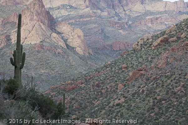
The original image of “Saguaro on the Apache Trail” as first rendered from a RAW file by my default Lightroom settings.
The very first thing I did in post-processing was to crop the image to get rid of parts I never wanted in the first place.
Next I increased the Exposure a bit and adjusted the Color Temperature of the image to look more like the late afternoon light it was shot under. The default setting had way too much blue in it.
In the next few steps I adjusted a number of settings to make the image more interesting. I adjusted the white and black points, which determine the lightest and darkest pixels in the image. I adjusted the lighter areas downward slightly to remove some glare from the rocks, and I also darkened the shadow areas to give the foreground more impact. I then added some contrast and some sharpening, a necessity with most digital cameras to overcome the softening added by the camera (more on this in a future article).
And that’s all I did, initially. You can see that none of these changes was in any way drastic, as the differences from one version to the next are incremental. In fact, these are the same sorts of adjustments I apply to all of my images.
After looking at the “finished” image for a while, I decided that one more change was necessary. The image was screaming out to be cropped into a true panoramic image – the junk in the bottom left was simply too distracting and was killing the image. So with one more adjustment to cropping, we arrived at the version I’ve been displaying at art fairs.
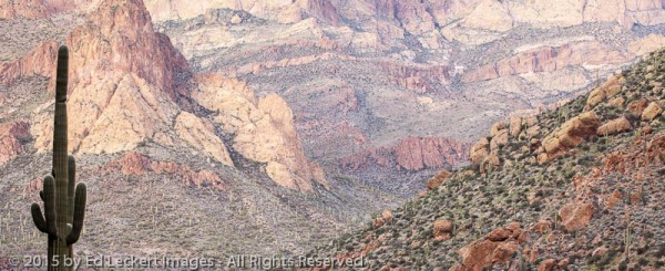
A saguaro cactus stands tall over the valley along the Apache Trail, in Tonto National Forest, Arizona.
Speaking of fair, I should mention that the print I show is a canvas print, so the added texture of the print surface helps add to the painterly effect. But even on glossy paper and onscreen it has that painterly look to it. Why?
I think it’s just a function of the muted pastel colors in the rock and the way the desert plants appear almost like dots applied with a paintbrush. I think it fools the brain by reminding us of techniques we’ve seen in paintings all our lives. But maybe there’s something else going on here that I’m missing. What do you think?
Leave a comment with your thoughts on why this looks so much like a painting!

Nice news letter Ed. Thanks for the photo tips. I need a new camera.
Do you also use bracketing? I think that is the term used for when the camera takes three pictures with slight exposure adjustments so that you have more to work with during editing.
The most creative I get is to use a polarizer under certain light conditions to reduce glare and increase color, but sometimes it results in too dark of a picture. Our latest road trip was through Idaho, Jackson hole, Yellowstone, Bear tooth pass and western Montana. Great photo ops there for sure.
Max
Thanks, Max!
My idea of bracketing is to take your best guess at exposure and then shoot a frame or two at one to two stop increments in both directions from your best guess. But with digital, I can look at the LCD image and histogram and know with great certainty whether I need more or less exposure after the first shot, and then adjust in the correct direction if necessary. But if it’s a really contrasty scene then I suppose I might bracket a bit, trying to get the brightest parts of the scene right at the threshold of getting blown out.
That said, if you have an extremely contrasty scene and want to use HDR (high dynamic range) processing in post, the approach in the field is exactly the same as bracketing. You then take all of the bracketed shots and feed them into the HDR processor. However, while I sometimes collect bracketed exposures for HDR processing, I’m not really a fan of this technique. That’s just a personal preference.
If I take multiple exposures, I’m much more likely to be “bracketing” F stops to vary the depth of field, or shutter speed to vary the amount of blur, in moving water, for example, but I’m holding the exposure constant as I do this. Then I choose the image I prefer best while viewing it on a large monitor at home.
I almost always use a polarizer, except for astrophotography and macro shots. It reduces the exposure by about 2 stops, and you need to adjust the filter for the desired effect, not necessarily the maximum effect.
Hope this helps!
thanks Ed. I found your description of the post-editing process riveting and throughly illuminating….sincerely 🙂 -myra